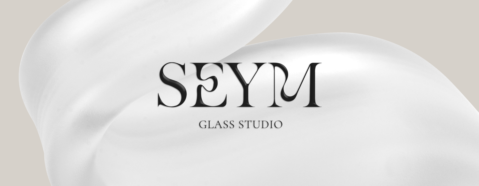
Seym Glass Studio Brand Identity Design
SEYM’s specialization lies in the meticulous craft of contemporary decorative objects, meticulously created through the application of traditional techniques. To encapsulate the delicate balance between time-honored traditions and modern aesthetics, a deliberate choice was made in selecting a classic serif typeface for logo design. However, the letter forms are intentionally distorted forging a seamless connection with products. This core design principle permeates the entire brand identity, where a collection of diverse object illustrations is curated.
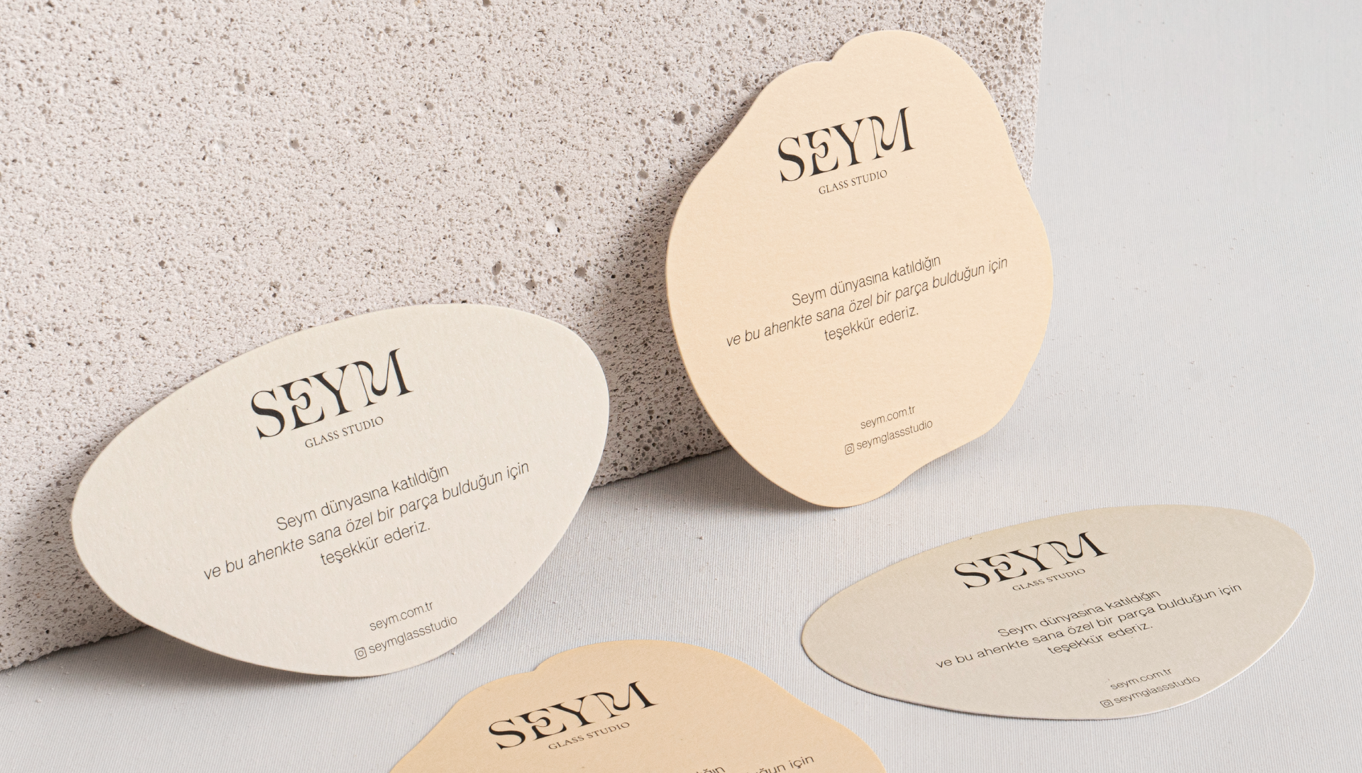
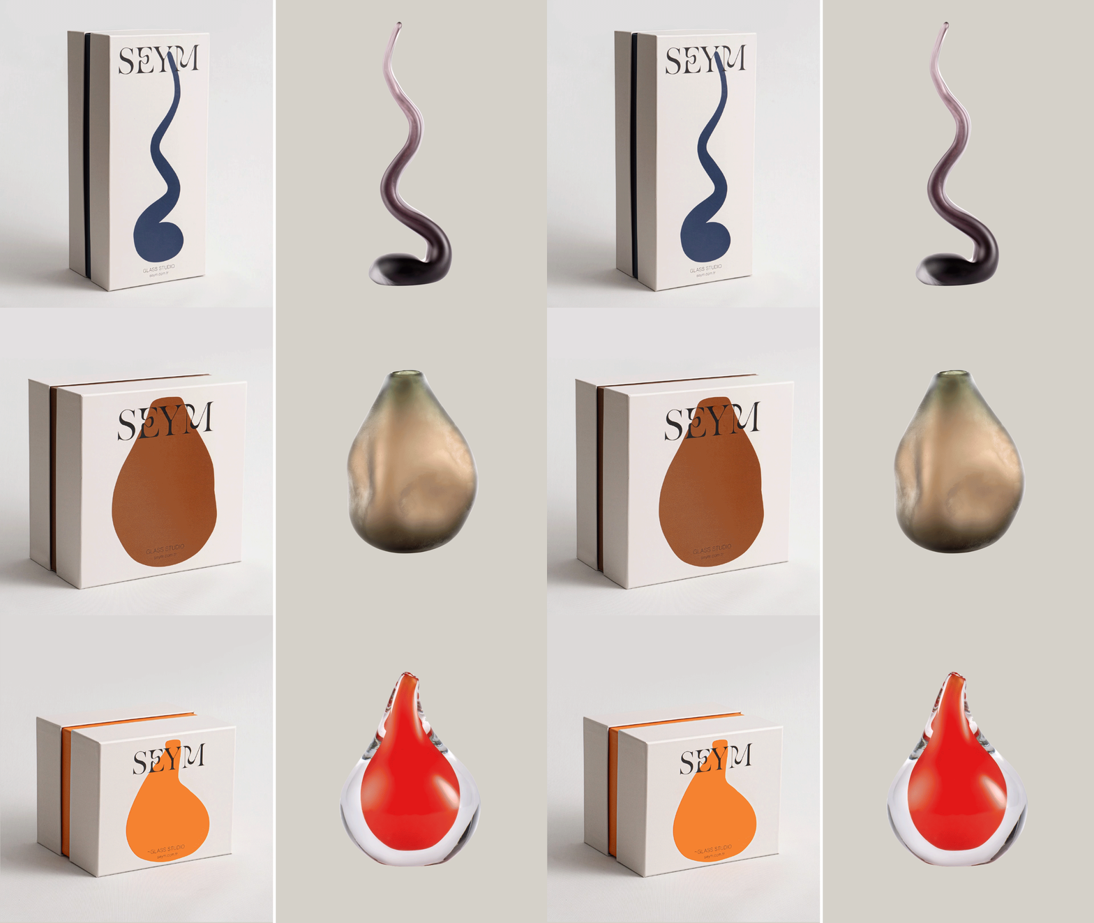
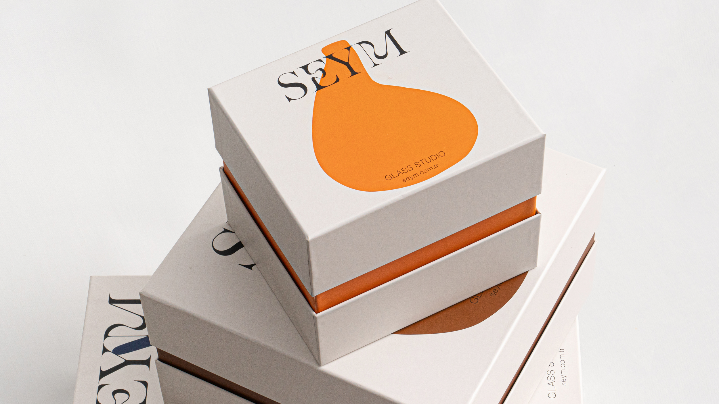
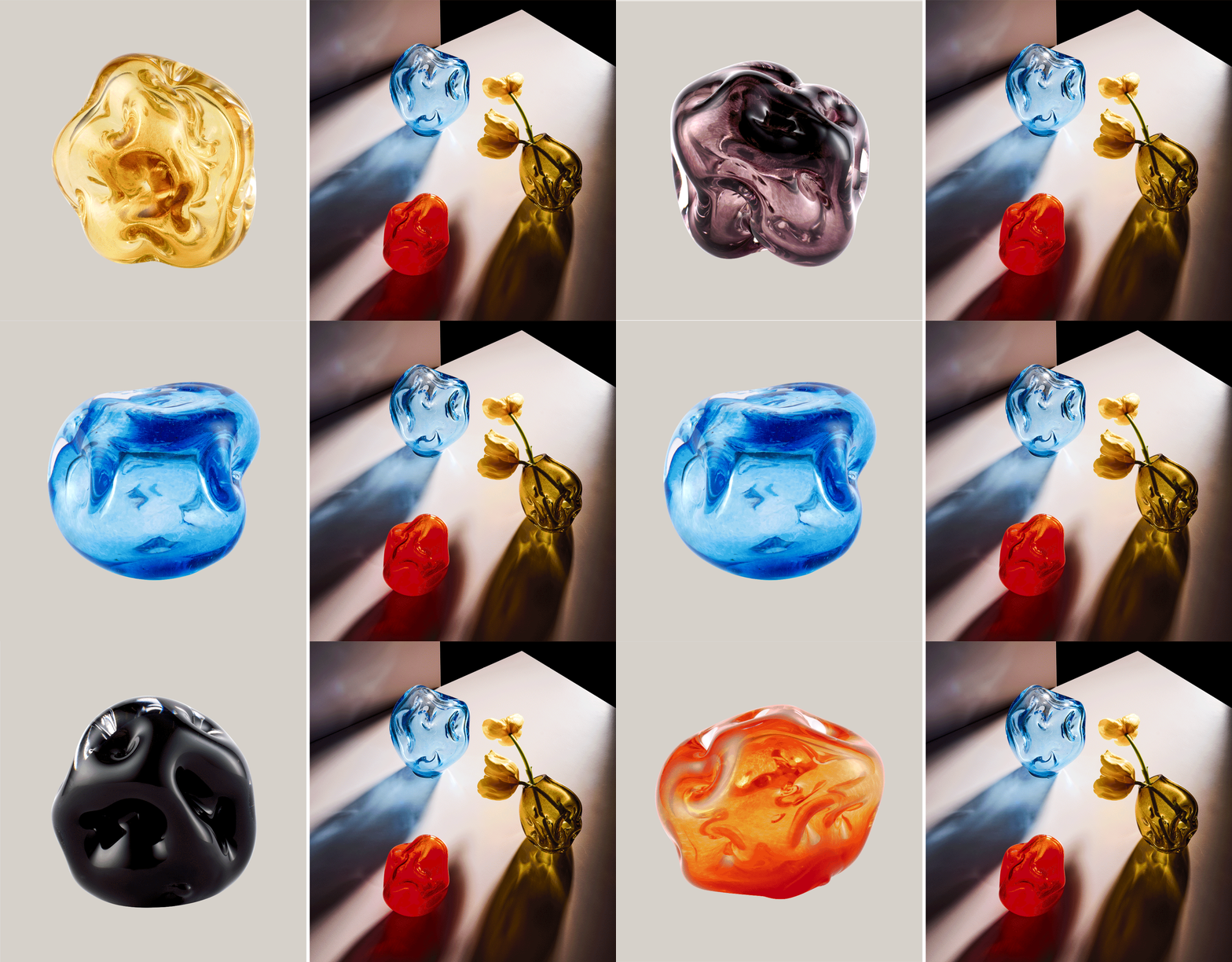
The product illustrations are dispersed, across the entire brand identity and packaging designs, strategically selecting sizes and shapes. This deliberate design choice adds a touch of artistry to the visual experience. Simultaneously, the color palette is drawn from the products themselves into the brand identity. The combination of these colors was carefully balanced harmonizing with the overall design aesthetic. Extended this approach even to the art direction of the photo shoot, treating each object as a work of art in its own right.





Creative Agency: No5 Istanbul
